Writer & Photography / Sandy King
A silver-iron method for making permanent prints in gold, palladium and platinum metals by Sandy King.
Always be careful when handling chemicals. Read the health and safety instructions.
What is a Kallitype? And a Little HistoryKallitype is one of a number of printing processes in the iron-silver family along with many others, including vandyke brown and argyrotype. There are some similarities among these processes, but in kallitype the light-sensitive element is ferric oxalate; in vandyke and argyrotype it is ferric ammonium citrate. The ferric oxalate makes a superior process in several important ways: it permits darker shadows, i.e. more Dmax, and it allows for extensive contrast control. The difference in Dmax is not huge between these processes, but well-made comparison prints side by side usually show more richness in the shadows of a kallitype than in a vandyke or argyrotype. However, the greatest advantage of kallitype over the ferric ammonium citrate based processes is greater control of contrast, which makes it possible to print negatives with a wider range of densities than with either vandyke or argyrotype.
The basic theory of kallitype printing is found in Sir John Herschel’s paper of 1842, On the Action of the Rays of the Solar Spectrum on Vegetable Colours, and on Some New Photographic Processes. However, it was not until 1889 that W. W. J. Nicol patented the first iron-silver process and he is widely considered to be the inventor of the kallitype. In Nicol’s original patent, the print was developed in a silver nitrate bath. He patented several revisions in the early 1890s and in one of these formulas he recommends using silver nitrate in the sensitizer rather than in the developer. This last revision is the method used by most contemporary kallitype printers.
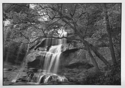
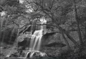
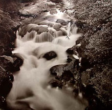
Image above: Whitewater Falls, North Carolina. 12X17 palladium toned Kallitype. Digital negative, from a 5X7 original. 2000. Near the North Carolina/South Carolina border.
Overview of the Process
To make a kallitype a suitable paper is first coated with a solution of ferric oxalate and silver nitrate, using either rod or brush. When dry, the sensitized paper is exposed to a negative under an ultraviolet light source. Since kallitype is a contact-printing process, exposure requires a same-size negative and some means of making the “sandwich” – a printing frame or vacuum frame, or even simply two sheets of heavy plate glass. After exposure, the paper is developed, cleared, toned, fixed, washed and dried.
The kallitype process is a very close cousin of platinum and palladium printing. Both processes are based on ferric oxalate as the light-sensitive element, and processing for both is almost identical. In fact, the developers and clearing agents used for platinum and palladium printing are often also used for kallitype. Moreover, a well-processed kallitype, when toned with platinum or palladium, is virtually identical in tonal range and color to a true platinum or palladium print. In fact it would be impossible, even for expert printers who work in these processes to distinguish between well-made kallitype and platinum prints made from the same negative.
In short, the kallitype process allows us to make prints that have the same tonal range and color as real palladium and platinum prints and that are just as permanent, but at much lower cost. The cost savings result in two ways. First, full toning of a kallitype print, in which the palladium or platinum metal replaces the silver, requires only about 1/10 to 1/5 as much metal as is required to make a straight palladium or platinum print. Second, in kallitype the toning is done after development and clearing, when it is fairly obvious if the print is a keeper or not. So, we don’t waste our precious metal on reject prints. Since platinum/palladium prints incorporate the metal in the sensitizer, the metal from a failed print cannot be saved.
There is another important factor in weighing relative costs. Since the actual cost of making even one very large palladium or platinum print is high, when we add in the number of wasted prints, the overall costs can be very great. And this can inhibit our creativity, as Carmen Lizardo suggests in her article on kallitype printing in Post-Factory Photography. Ms. Lizardo puts it this way:
Since printing kallitype is so much cheaper than printing platinum… it allows me to feel free, experiment, have fun, and make BIG beautiful prints.
Which is to say, kallitype frees us to be creative and to fully experiment with our materials.
And there is one final point of interest in the kallitype versus palladium and platinum comparison. While both processes can produce permanent prints that are visually identical, kallitype has the added advantage that it can also produce prints of different colors and tones via double or triple toning and metal additives in the sensitizer. One can, for example, use double and triple-toning with various combinations of gold, palladium and platinum to produce prints with split tones. For example, warm brown highlights and mid-tones are possible with cold purple/brown shadows. Such results are not altogether impossible in palladium and platinum but they are much more difficult to achieve because in toning it is very difficult to replace a more noble metal with a less noble one.
Notes on Image Permanence
As mentioned at the beginning of this article, the light-sensitive component of kallitype is ferric oxalate, which contains ferric iron, Fe (3+) and oxalate. On exposure to ultraviolet light, ferric iron is reduced to ferrous iron, Fe (2+). To make a permanent print, ferrous iron must be further reacted with something else. In kallitype printing, the something else is the noble metal silver.
 The major danger to long-term permanence of kallitype prints is residual ferrous iron, Fe(2+). If they are not completely removed from the paper during processing very small quantities of residual ferrous iron will eventually oxidize the silver, and the print will fade. The key to maximum archival quality with kallitype is direct toning in which the silver metal in the print is replaced with another noble metal that is resistant to oxidation by residual ferrous iron. The metals commonly used to tone kallitypes are gold, palladium and platinum. A kallitype processed for maximum archival stability, and toned with gold, palladium or platinum, will have great permanence. We could go even further: a kallitype print toned with palladium or platinum is almost an exact equivalent, both visually and in terms of image permanence, of a Pt/Pd print. Many people believe that toning results in coating or encapsulation of the silver metal with the more noble metal, but in fact, the process actually results in replacement of silver metal with the more noble metal.
Maximum permanence also requires the removal of all residual ferrous iron from the paper, fixing to remove unused silver, and the removal of all residual hypo, using hypo clearing agents and a thorough wash.
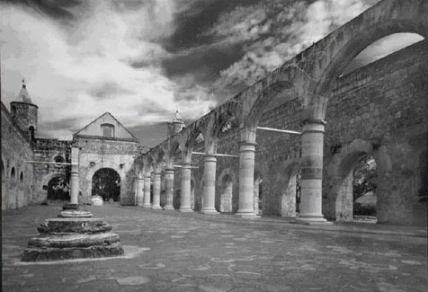
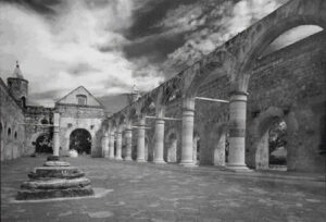
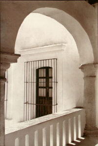
Image above: The “Ex-Convento” of Cuilapan. 12X17″ palladium toned Kallitype. Digital negative from a 5X7 original. 2004. Near Oaxaca, Mexico
About My Method
Many people are turned off by kallitype because of its seeming complexity. Virtually every text on kallitype lists numerous developer formulas, each capable of providing a different color or tone, with an infinite number of variations in processing. This can be very confusing for persons just taking up the process. If you really want to know how complicated kallitype printing can become, have a look at Dick Stevens’ Making Kallitypes: A Definitive Guide, a wonderful reference book but not a very good working guide.
My method for making kallitypes is based on a limited number of working options and is rooted in two basic principles:
- a limited number of very specific working directions
- all kallitype prints should be processed for maximum permanence
The ultimate stability and permanence of kallitype prints depends on careful processing, which includes toning. This article provides instructions for toning with gold, palladium or platinum, which should be done before fixing, and with selenium, which must be used after fixing.
Necessary Materials
The Basic Chemicals
- Silver nitrate crystals – sensitizer
- Ferric oxalate powder – sensitizer
- Sodium thiosulfate crystals – fixer
- Sodium citrate – developer
- Sodium sulfite – fixer and hypo clearing agent
- Citric acid – clearing agent
- Potassium Chloroplatinite 20% solution – toning solution
- Sodium Chloropalladite 20% solution – toning solution
- Gold chloride 5% Solution – toning solution

Kallitype requires six different solutions:
- sensitizer
- developer
- clearing agent
- toner
- fixer
- hypo-clear
1. Sensitizer
The sensitizer is prepared as two separate stock solutions, solution A and solution B, which are mixed in equal parts just before use.
Solution A – 10% silver nitrate
Mix 10g silver nitrate in 70 ml distilled water. Allow to dissolve and then add water to make a total of 100ml of solution.
Solution B – 20% ferric oxalate
Mix 20g ferric oxalate powder in 75ml distilled water. Allow to dissolve and then add water to make a total of 100 ml of solution. Ferric oxalate takes a long time to go into solution and should be mixed about 24 hours before use. In powder form it lasts indefinitely, but once mixed with water it will slowly degrade, with a resulting increase in print fog. For best results mix no more solution than you expect to use over a period of two to three months.
2. Developer
The developer is a 20% solution of sodium citrate. To mix, add 200g of sodium citrate to 750ml distilled water, stir until completely dissolved, then add water to 1000ml.
3. Clearing Agent
The clearing agent is a 3% solution of citric acid. To prepare, add 30g of citric acid to 750ml water, stir until completely dissolved, then add water to 1000ml.
4. Toner
See the section at the end of this article for various toner formulas.
5. Fixer
Add 50g sodium thiosulfate, 10g sodium carbonate and 2g sodium sulfite to 750ml water. Stir. When dissolved, add water to 1000ml. You can also prepare the fixer as a concentrated solution at 4X the strength above and dilute 1:3 for a working solution.
6. Hypo Clear
The hypo clear is a simple 1% sodium sulfite solution. To prepare, add 10g sodium sulfite to 1000ml water and stir until completely dissolved. This solution should be mixed just before use and discarded at the end of the work session.
Paper
Choosing a suitable paper is one of the most important factors in making kallitypes. Papers that will not clear completely in about 4-5 minutes should not be used. The requirements for a good paper for kallitype are virtually identical to those needed for platinum and palladium. Most of the papers that work well with pt/pd printing also work well for kallitype. I have had good success in kallitype with Crane’s Platinotype, Arches Platine, Bristol 2-ply Rising and Stonehenge Rising. Of these, my personal preference is Stonehenge Rising. It has a nice pebbly surface, gives good image detail, clears easily, is relatively inexpensive, and is very consistent from batch to batch. You can also read more about paper recommendations in The Big Paper Survey.
Light Source
 Printing requires a light source high in ultraviolet light, of which there are a variety: the sun, a bank of BL (black-light) fluorescent tubes, mercury vapor and metal halide HID (high intensity discharge) lamps, as well as commercial plate burners such as the Nuarc 26-1K. More information on light systems can be found in my article Ultraviolet Light Sources for Printing with the Alternative Processes on Unblinking Eye.
Image above: Interior of Museum. 12X17″ palladium toned Kallitype. Digital negative from a 5X7. 2005. Oaxaca, Mexico
The negative
Although considerable contrast control is available in kallitype, it is always best to start with a good negative and then apply corrective controls later. The best negative for kallitype has a DR (density range) of about log 1.8. For persons who do not understand the concept of density range, a negative with a DR of 1.8 is very contrasty and would require a grade #0 or #1 paper. If you are making in-camera negatives with sheet film, this density range can be achieved by developing the film about 50% longer than normal for silver gelatin #2 paper.
Excellent enlarged negatives for kallitype can also be made digitally, from 35mm roll film and sheet film originals. The original negative or transparency is scanned, worked on in Photoshop to give the best possible print on screen, given a curve adjustment, and then printed on overhead transparency film on one of the modern inkjet printers. I make my digital negatives with an Epson 2200 printer using Mark Nelson’s PDN (Precision Digital Negatives) system, but numerous other systems and printers can be used. One great advantage of digital negatives over original camera negatives is that they will all print with about the same density and contrast range, so that exposure time and contrast will be virtually identical. A detailed account of making digital negatives is beyond the scope of this article so for working information consult either Mark Nelson’s book, Precision Digital Negatives, or Dan Burkholder’s Making Digital Negatives for Contact Printing. You can also read Jim Read’s article on Making Digital Negatives here.
It is certainly possible to make good enlarged negatives for contact printing with continuous tone films, but frankly I have found the advantages of working with digital negatives are so great, and the quality so outstanding, that I really cannot recommend wet processing.
Some traditionalists bemoan the use of any kind of digital technology but the fact of the matter is that technology that allow us to make digital negatives – which are better than wet processing negatives – has played an important role in increasing the popularity and use of alternative processes during the past 5-10 years. The use of digital negatives has quite literally opened the door to alternative processes for persons using 35mm and roll film cameras in a way that wet processing – because it is so complicated and time-consuming – would not allow. The bottom line is that from a purely practical point of view the synthesis of digital negatives with traditional print-making methods is the best method of promoting the continuing use of traditional and historical processes.
You will probably want to mask your negatives to eliminate brush strokes on the final print. My preferred method, especially with digital negatives, is to tape around the image area with red lithographer’s tape. Another method of masking is to just cut a frame in construction paper or Goldenrod paper that is just slightly smaller than the printing area of the negative, and tape the negative to this frame during printing.

Contact Printing Frame or Vacuum Frame
For sharp prints, good contact between the negative and sensitized paper is critical. Lacking good contact, the print will have an overall soft look with localized blurry areas. A contact printing frame is adequate for prints up to about 8×10 inches, but for larger sizes I recommend a vacuum frame for best results.
Working Procedures
To avoid spreading trays all over my darkroom I recommend carrying out all processing in just one tray.
1Mix the sensitizer
Prepare the sensitizer by mixing equal parts of Solution A (10% silver nitrate) and Solution B (20% ferric oxalate). About 2ml of combined solution is adequate for an 8×10 print, or the equivalent.
2 Coat the Paper
Begin the coating operation by placing several sheets of newspaper on a flat, level surface, and then tape the paper you will be coating to the newspaper to prevent it from moving around as you brush on the sensitizer. Measure out the required amount of sensitizer and gently pour it over the center of the paper. Using a good-quality hake brush, or an artists’ brush like the Jack Richeson 9010, quickly spread the sensitizer over the printing area of the paper, stroking lightly across the paper from left to right, then from bottom to top, and finally on the diagonal. Continue with light brushing until there is no more pooling of the sensitizer, at which point stop.
 Many people double coat, which with some papers gives higher Dmax and richness in the shadows. If you double coat, wait for about five minutes after applying the first coat, and then repeat the process.
A glass coating rod can be used in lieu of a brush if only one coating is desired. For double coating, however, the use of a brush gives much better results than a rod.
3Dry the Sensitized Paper
When the coating operation is completed leave the paper taped to the paper for about five minutes, then hang to dry. Drying will take about 15-30 minutes, depending on temperature and humidity. A fan may be used to accelerate drying, but DO NOT force dry with heat, as this may result in a loss of Dmax and fogging.
4Expose the Sensitized Paper
Place the emulsion side of the negative in contact with the sensitized paper, with the base of the negative facing the light, and place the sandwich in a contact printing frame, vacuum frame, or between two heavy sheets of glass, and expose to UV light.
 5 Development
After exposure, place the print in the tray face up; pour the developer (20% sodium citrate) over it as quickly as possible, and develop for two (2) minutes.
Development is visually complete in about 15-30 seconds, but a longer development time is important for archival purposes: much of the residual ferric iron, which if left in the print could cause loss of permanence, is removed at this stage. Development can be ended when most of the stain on the sensitized but unexposed areas of the print, i.e. the coated areas that were masked during exposure, has been removed.
Image above: The Chatooga River from the Old Iron Bridge. 18X20″ Platinum toned kallitype from a 20X24″ in-camer negative. 2002. Near Highlands, North Carolina.
Contrast can be controlled by the addition to the developer of a few ml of a 5% solution of potassium dichromate solution. The practical limit ranges from as little as 1 ml per liter of developer up to about 16 ml per liter. This allows the use of negatives from a DR as low as about 1.2 to a maximum of about 2.2. If too much dichromate is added, printing times will increase considerably and the image will take on a granular look. For negatives that have been developed to a DR of about 1.8 add about 2ml of the 5% potassium dichromate per liter of developer.
The developer can be reused, but it must be replenished. I recommend replenishment at the rate of about 100 ml of developer for every 100 square inches of print surface developed. If the developer is not replenished the accumulation of ferrous iron and chemicals from the paper will make it increasingly difficult to clear the print during processing. This will result in an unpleasant stain in the areas of the print that were coated but masked in printing. The stain is not only unattractive, but will also decrease the permanence of the print because it consists in large part of residual ferrous iron that has been converted to iron hydroxide.
After development in sodium citrate the print will have have a rather flat brown color. Subsequent processing will increase contrast and change the color of the final image quite dramatically.
6Rinse (Optional)
After development, rinse the print for 1-2 minutes in running water. It is very important that this first rinse be done in water that is either neutral or slightly acidic. If the first rinse is alkaline, ferrous hydroxide compounds may be formed in the paper, making complete clearing difficult or impossible.
It is possible to eliminate this first rinse entirely and go directly from development to clearing. Eliminating the wash reduces the possibility of hydroxide compounds being formed in the paper. The only drawback to elimination of the wash is that the first clearing bath will need to be renewed more frequently as it will pick up most of the residual chemicals left in the paper after development that would be eliminated with the wash.
7Clearing
Clear the print until there is absolutely no stain left in the sensitized but unexposed areas of the print. The time for the paper to completely clear will vary with different papers, and sometimes even with the same paper manufactured at different times. However, if the paper takes more than about ten minutes to clear, I would consider it of marginal quality for kallitype work and try to find a better one. Renew the citric acid bath frequently, as this chemical is very inexpensive and proper clearing is absolutely vital to print stability. The image will lighten considerably during clearing, but don’t worry. All of the density lost during toning will return when the print is toned.
Clearing should be done with two separate clearing baths, called Bath #1 and Bath #2, with the print remaining in each for about five minutes. When Bath #1 takes on a very cloudy appearance, renew it with fresh solution and make it Bath #2, moving the old Bath #2 to the first position.
Should the print not have completely cleared by the end of the second clearing bath it is best to proceed with toning and then after toning clear again in a 1/2% solution of hydrochloric acid. If clearing continues for too long before toning the silver image will eventually bleach, and print density will be lost. The gold, palladium and platinum metal that replace the silver during toning is very stable and will bleach very little, if at all, in the hydrochloric clearing bath, which is much more aggressive than citric acid in removing iron hydroxide stains.
This procedure is especially useful with prints that have been double coated because the stain is very hard to eliminate completely with some papers when two coats of sensitizer have been applied.
8Rinse (Optional)
After clearing, rinse the print for 30-60 seconds in running water. The second rinse is not required when toning with the gold, palladium and platinum toners that contain citric acid.
9Toning
Tone for the time necessary, which can vary from 5-20 minutes depending on the strength and amount of toner. With most toners, toning begins first in the highlights, proceeds to the midtones, and ends with the shadows. The print is fully toned when the shadows have taken on the color that is characteristic of the toning metal. When using the gold, palladium and platinum toners at the dilutions recommended in this article the print should be fully toned in about five minutes.
10Rinse
After toning, rinse the print in running water for 60 seconds.
11Fix
Fix for four minutes. For maximum archival quality, use two separate fixing baths and fix for two minutes in each, with a 30-second rinse in running water between. The second bath should always be fresh fixer.
12Rinse
After fixing, rinse in running water for one minute.
13Hypo Clear
Place the print in a 1% solution of sodium sulfite for two minutes. Commercial products such as Kodak Hypo-Clear or Perma Wash can also be used.
12Final wash
Rinse the print in running water for 20-30 minutes. If you omit the hypo clear bath, final wash time should be an hour.
15 Dry
Dry
Hang the print to dry, or place on a drying rack.
Refinements to the Process
As you begin to work with kallitype you will learn that there are literally dozens and dozens of variations of the process, ranging from developer formulations capable of rendering a wide range of colors and tone, to sensitizer additives which can alter color and tonal range. I recommend sticking with the sodium citrate developer until you become very familiar with the process. In fact, there is really no reason to use any other developer unless you want an unusual color that cannot be rendered through toning with gold, platinum or palladium. However, as noted earlier, the permanence of kallitype prints is greatly increased by replacing the silver metal with more noble metals.
Metal Additives
The addition of small amounts of certain metallic salts to the working sensitizer can modify the color and tonal range of the final image and also, in combination with double toning, produce interesting split tones in the image. The metals most commonly used are gold, platinum, palladium, and mercury. The effects obtained by adding the metallic salt directly to the sensitizer are different from toning
Gold Additive
Prepare a gold chloride working solution by mixing 5ml of a 1% gold chloride solution with 20ml distilled water. Add the working solution to the sensitizer at about 1 part gold working solution to 9 parts sensitizer. The addition of gold will give a warm brown-olive tone to the final print.
Platinum or Palladium Additive
Prepare a platinum or palladium working solution by mixing 5ml of potassium chloroplatinite 20% solution or sodium chloropalladite 20% solution with 20ml of distilled water. Add the working solution at the same ratio as gold, one part working palladium or platinum solution to 9 parts sensitizer. The addition of platinum or palladium will give a neutral black or a warm black, depending on which metal is used.
Mercury Additive
Prepare a concentrated mercury solution by mixing 1g of mercuric chloride with 30ml distilled water. Add the working solution to the sensitizer at the ratio of about 1 part working solution to 20 parts sensitizer. Expect a warm olive tone, but results can be somewhat unpredictable. Handle this solution with maximum care because mercuric chloride is a hazardous substance.
Unfortunately the employment of metal has one important negative effect. The image is more likely to stain and the print will be much more difficult to clear. Stevens suggests that use of nitrates of gold, palladium and platinum instead of the chlorides will eliminate staining, but those compounds are not readily available.
Should you become seriously interested in the use of metal additives, I would recommend further reading in Dick Steven’s book, Making Kallitypes: A Definitive Guide, pp. 92-95.
Toning
Many people like the native color of kallitype prints and do not tone them. This is a mistake, in my opinion, because toning provides much greater image permanence. In fact, there is little doubt thatmost untoned kallitype images will fade within a relatively short period of time. It is virtually impossible to remove all residual ferrous iron from the paper, and if any at all remains it will eventually cause the silver to oxidize, ultimately leading to fading. Fading may take several decades but it is almost certain to happen with time.
Although the major reason we tone kallitypes is for permanence, toning has other benefits. One of the primary benefits is that images toned before fixing with gold, platinum or palladium will not fade in the fixing bath. The major reason for fading, or image recession during fixing, is bleaching of the silver. A print which has been toned with one of the more noble metals will not fade or recede in fixing because these metals will not bleach in most normal fixing solutions.
Another reason to tone is that it eliminates the effects of solarization in over-exposed shadow areas. In heavily exposed areas we frequently see tone reversal in untoned kallitypes, i.e. with increasing exposure the shadow areas actually get lighter. This look can be very unpleasant. Toning with gold, platinum or palladium counteracts tone reversal and restores normal tonal values to the heavily exposed shadow areas.
Finally, through double toning, in which more than one metal is used to tone the print, it is possible to produce a variety of tones and colors, an effect which can be aesthetically interesting and pleasing.
The toning formula in this article are based on mixing 1-liter amounts. However, for maximum consistency I suggest that you tone as a one-shot solution, using the minimum amount of fresh solution possible, and then discard after use. You will need approximately 20ml of solution to fully tone a 5×7″ image, or the equivalent for larger images. The use of such small quantities of toning solution requires a flat tray, with no ribs or grooves.
Gold Toners
Both of the gold toners given below give a very attractive purple/brown/blue tone. Image contrast is increased by about a step through loss of density in the high values, but Dmax values (shadows) are changed little if at all.
Gold Toner #1
| Citric acid | 5g |
| 5% gold chloride sol. | 5ml |
| Distilled water to make | 1000ml |
This toner does not keep particularly well so it is best to mix it in small quantities just before it is needed, and of course discard after use.
Gold Toner #2
| 1% gold chloride | 50ml |
| 1% thiourea | 50ml |
| Tartaric acid | 0.5g |
| Distilled water to make | 1000ml |
This toner keeps well and retains its working characteristics even after moderate use. However, I strongly recommend that you use as little solution as possible to tone and then store the used solution in a separate bottle so that the fresh solution does not become contaminated.
One of the interesting qualities of Gold Toner #2 is that it works on all areas of the print – shadows, midtones and highlights – at about the same time, unlike Gold Toner #1, which works first on the highlights, then progressively on the midtones and shadows.
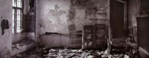 Image above: Ruins at Montauck. 7×17 Gold toned Kallitype from a 7×17 in-camera negative. 2001. Montauck, New York.
Platinum and Palladium Toner
| Citric acid | 5g |
| Potassium chloroplatinite 20% solution | 5ml |
| OR sodium chloropalladite 20% solution | 5ml |
| Water | 1000ml |
 The platinum and palladium toners keeps well and can be stored fresh in one-liter amounts for up to several months. For consistent results I recommend that they be used as one-shot solutions and discarded after use. Prints toned with platinum will have a very neutral black tone, while those toned with palladium have a brownish/black color. Intermediate tones can be obtained by mixing the two toners. With the Pt/Pd toners, the final density of the print will be somewhat greater than if the print were not toned at all, but contrast will be very similar.
Image above: The Casa of Cortes. 12X17″ palladium toned Kallitype, digital negative from a 5×7 original. 2005. Oaxaca. Mexico.
Selenium Toners
In selenium toning, metallic silver is converted to a silver selenide, which is highly resistant to the effects of oxidizing agents. In practice it is extremely difficult to get satisfactory results with selenium when toning is done before fixing, because it reacts with residual silver nitrate in the paper and causes staining. For this reason, I recommend that toning with selenium be done after fixing. This may require an adjustment in exposure time when compared to toning with gold, palladium and platinum because there will likely be some bleaching of the print during the process.
Selenium Toner #1
To prepare a stock solution, add 100g sodium sulfite to 100ml hot water and allow to dissolve completely. Then add 10g selenium powder.
A working toner is mixed by adding 100ml stock solution to water to make a total of 1000ml, or the equivalent. Stronger solutions give browner prints, weaker solutions, cooler tones.
 Selenium Toner #2
| Kodak Rapid-Selenium | 10ml |
| Distilled water to make | 1000ml |
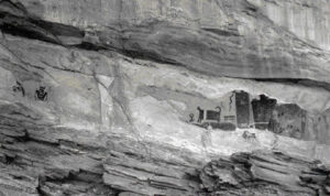
Image above: Temple Mountain Wash. 12X20″ palladium toned kallitype, digital negative, from a 12X20 original. 2004. Utah.
Double toning is used to produce what is known as split toning, i.e. parts of the image are toned with one metal, with its characteristic color, and other parts are toned with another metal. This kind of toning must begin with the most noble metal, either platinum or palladium, and be completed with the least noble, gold. This is because the most noble metal will always replace the least noble and if toning is done first with gold, and followed to completion with platinum or palladium, the image will look as if it has been toned in just platinum or palladium.
One way to achieve split tones is to begin toning with platinum or palladium and allow the toning process to continue just until the platinum or palladium has replaced the silver in the highlights and mid-tones. Then, discard the toner, wash the print, and pour in the gold toning solution. The gold toner cannot replace the palladium or platinum in the highlights and mid-tones, since it is less noble, but it will replace the silver in the shadow areas. The result will be a print with neutral black or warm black highlights but cool purple/black shadows. This can be a very pleasing look.
Thus, the key is to begin toning with the most noble metal and tone only until the desired values have been changed, then wash and tone to completion with the least noble metal.
Double toning can produce fascinating results and I encourage you to experiment with it.
If you have never attempted any hand-coated processes, the instructions in this article may appear somewhat daunting, but in fact making kallitypes is a fairly straight-forward operation that anyone with a bit of enthusiasm can learn to do well with just a few printing sessions. It will take a bit of patience in the beginning, and you will make some mistakes, but once you get the hang of it you will feel a sense of liberation from the mass technology and factory coated papers because there is truly nothing more exhilarating than to follow in the footsteps of our photographic ancestors who in their darkrooms throughout the world coated their own emulsions and papers in paving the way for the photographic heritage we have all inherited.
Acknowledgements
In concluding this article I would like to express thanks to my friend and colleague Sam Wang for his inspiration and support in my work with kallitype and vandyke printing. I also thank Ed Buffaloe for final proofing of the text of the original version and for correction of certain factual errors. And special appreciation is owed to Judy Seigel for her close reading of the text and for editorial suggestions which have greatly improved the article. I would also like to express my appreciation to the many kind persons on the alt-photo-process list who have generously shared their extensive knowledge and expertise with alternative printing processes.
Bibliography
Barnier, John, ed. Coming Into Focus, San Francisco: Chronicle Books, 2000. (See Chapter 9, “kallitype,” pp. 131-151, by W. Russell Young III)
Burkholder, Dan. Making Digital Negatives for Contact Printing. San Antonio: Bladed Iris Press, 2002.
Crawford, William. The Keepers of Light, Dobbs Ferry, New York: Morgan and Morgan, 1979. (See pp. 177-80)
The World Journal of Post-Factory Photography, ed. Judy Seigel. No. 8, 2003. (See article by Carmen Lizardo, and notes with Sandy King, pp. 18-25.
Farber, Richard. Historic Photographic Processes, New York: Allworth Press, 1998. (See Chapter Six, kallitype, pp. 73-85.
Dick Sullivan, Traditional Kallitype Printing, at the Bostick and Sullivan website. Also available as a .pdf file at the B&S website is a long article, “The kallitype Process”, reproduced from No. 47 of the Photo-Miniature, February, 19093.
Stevens, Dick. Making Kallitypes: A Definitive Guide. Focal Press, Boston & London
Sandy King is the author of numerous published works on photographic esthetics and techniques. He is one of the leading authorities in the world on carbon printing and is author of a manual on Carbon and Carbro printing, The Book of Carbon and Carbro: Contemporary: Procedures for Monochrome Pigment Printmaking (self-published, 2002), and several articles on carbon printing.
Recommended reading:

Making Kallitypes – A Definitive Guide
by Dick Stevens

Precision Digital Negatives
by Mark I. Nelson
Read more on: PrecisionDigitalNegatives.com

Making Digital Negatives for Contact Printing
by Dan Burkholder